Blogger platform always provides just a simple navigation bar to its blogs and bloggers are not able to change this navigation menu bar into Drop Down Navigation menu bar.
Today in this post i will tell you how to add a Unique style Drop Down Navigation menu bar to your blog.The regular drop down menu we are used to seeing will when a link is hovered over display more links vertically below.This menu bar is quite different from all these menu bars on this bar when cursor came onto a hover link it shows the other links horizontally in other bar just below the menu.From some times i am working on this bar but i always have to use jQuery scripts but finally i got some Css tips through which i able to create this bar and it uses only Css with some HTML coding that's why its easy to install in Blogs.
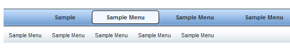
You still probably wondering how it displays the link horizontally instead of Vertically so i have a screen shot and live demo you can check out below.

Now Lets see how to add this navigation bar into your blog.
Adding The Drop Down Navigation Menu Bar:
Remember to backup your template always before making any changes into your blog.Now lets start the steps.
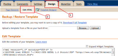
Step 1.) Go to your Blogger Dashboard Click on Design > Edit HTML
Step 2.) Find the following piece of code into your Blogs HTML (Press CTRL + F for a search bar to search this code quickly).
]]></b:skin>
Step 3.) Copy and paste the following code directly above/before the ]]></b:skin>
.nav {
height:35px;
background:url(https://blogger.googleusercontent.com/img/b/R29vZ2xl/AVvXsEjt1dTQUS6kpV_cef9t3sxgtXZWP7ZBf5jVbfzLqOnjN1hKpB04iv9CTqHDktBzasR4PmW6oxTMwIY-Yn6b5QxEMIWBwTEC5Ai9Ywn7HK7gUiG6VtSb-FCdfWZIzgpLvsReCF5zuEQk7udQ/s1600/bg.gif) repeat-x;
position:relative;
font-family:arial, verdana, sans-serif;
font-size:11px;
width:100%;
z-index:100;
margin:0;
padding:0;
}
.nav .table {
display:table;
margin:0 auto;
}
.nav .select,
.nav .current {
margin:0;
padding:0;
list-style:none;
display:table-cell;
white-space:nowrap;
}
.nav li {
margin:0;
padding:0;
height:auto;
float:left;
}
.nav .select a {
display:block;
height:35px;
float:left;
font-weight:bold;
background: url(https://blogger.googleusercontent.com/img/b/R29vZ2xl/AVvXsEjt1dTQUS6kpV_cef9t3sxgtXZWP7ZBf5jVbfzLqOnjN1hKpB04iv9CTqHDktBzasR4PmW6oxTMwIY-Yn6b5QxEMIWBwTEC5Ai9Ywn7HK7gUiG6VtSb-FCdfWZIzgpLvsReCF5zuEQk7udQ/s1600/bg.gif);
padding:0 30px 0 30px;
text-decoration:none;
line-height:35px;
white-space:nowrap;
color:#2b3238;
}
.nav .select a:hover,
.nav .select li:hover a {
background: url(https://blogger.googleusercontent.com/img/b/R29vZ2xl/AVvXsEje-4zpeiv_-H1UVEXMhLOXd4wuLCSG-br9TrsNOyh1U-mwPkCnrwkrao1L94EqeSMt1hxGArb6-goRnpmm0N5JObg6zBlbvrDPcRtT0IZ0WvheoXujN4_ZfQYrL5Jt5Ozj62xfX5vp2oHy/s1600/hover.gif);
padding:0 0 0 15px;
cursor:pointer;
color:#2b3238;
}
.nav .select a b{
font-weight:bold;
}
.nav .select a:hover b,
.nav .select li:hover a b {
display:block;
float:left;
padding:0 30px 0 15px;
background:url(https://blogger.googleusercontent.com/img/b/R29vZ2xl/AVvXsEje-4zpeiv_-H1UVEXMhLOXd4wuLCSG-br9TrsNOyh1U-mwPkCnrwkrao1L94EqeSMt1hxGArb6-goRnpmm0N5JObg6zBlbvrDPcRtT0IZ0WvheoXujN4_ZfQYrL5Jt5Ozj62xfX5vp2oHy/s1600/hover.gif) right top;
cursor:pointer;
}
.nav .select_sub {
display:none;
}
/* IE6 only */
.nav table {
border-collapse:collapse;
margin:-1px;
font-size:1em;
width:0;
height:0;
}
.nav .sub {
display:table;
margin:0 auto;
padding:0;
list-style:none;
}
.nav .sub_active .current_sub a,
.nav .sub_active a:hover {
background:transparent;
color:#2b3238;
}
.nav .select :hover .select_sub,
.nav .current .show {
display:block;
position:absolute;
width:100%;
top:35px;
background:url(https://blogger.googleusercontent.com/img/b/R29vZ2xl/AVvXsEj3Tje2MQYqVHcguo7kJfgZyOLRtNRBTuZC-KtjBHnknA8WvVj5B8X2XLPDN-fUbp9fWAuSLyXqcaPrJjZ58XwiSph36mOQS9-tWRladiKT-bXE7a2QkYMt5-mwS7IKunyOgaTTTB2C7NkO/s1600/back.gif);
padding:0;
z-index:100;
left:0;
text-align:center;
}
.nav .current .show {
z-index:10;
}
.nav .select :hover .sub li a,
.nav .current .show .sub li a {
display:block;
float:left;
background:transparent;
padding:0 10px 0 10px;
margin:0;
white-space:nowrap;
border:0;
color:#2b3238;
}
.nav .current .sub li.sub_show a {
color:#2b3238;
cursor:default;
}
.nav .select .sub li a {
font-weight:normal;
}
.nav .select :hover .sub li a:hover,
.nav .current .sub li a:hover {
visibility:visible;
color:#73a0d2;
}
<!--[if IE]>
.nav ul {display:inline-block;}
.nav ul {display:inline;}
.nav ul li {float:left;}
.nav {text-align:center;}
.nav .select a:hover b,
.nav .select li:hover a b {float:none;}
<![endif]-->
height:35px;
background:url(https://blogger.googleusercontent.com/img/b/R29vZ2xl/AVvXsEjt1dTQUS6kpV_cef9t3sxgtXZWP7ZBf5jVbfzLqOnjN1hKpB04iv9CTqHDktBzasR4PmW6oxTMwIY-Yn6b5QxEMIWBwTEC5Ai9Ywn7HK7gUiG6VtSb-FCdfWZIzgpLvsReCF5zuEQk7udQ/s1600/bg.gif) repeat-x;
position:relative;
font-family:arial, verdana, sans-serif;
font-size:11px;
width:100%;
z-index:100;
margin:0;
padding:0;
}
.nav .table {
display:table;
margin:0 auto;
}
.nav .select,
.nav .current {
margin:0;
padding:0;
list-style:none;
display:table-cell;
white-space:nowrap;
}
.nav li {
margin:0;
padding:0;
height:auto;
float:left;
}
.nav .select a {
display:block;
height:35px;
float:left;
font-weight:bold;
background: url(https://blogger.googleusercontent.com/img/b/R29vZ2xl/AVvXsEjt1dTQUS6kpV_cef9t3sxgtXZWP7ZBf5jVbfzLqOnjN1hKpB04iv9CTqHDktBzasR4PmW6oxTMwIY-Yn6b5QxEMIWBwTEC5Ai9Ywn7HK7gUiG6VtSb-FCdfWZIzgpLvsReCF5zuEQk7udQ/s1600/bg.gif);
padding:0 30px 0 30px;
text-decoration:none;
line-height:35px;
white-space:nowrap;
color:#2b3238;
}
.nav .select a:hover,
.nav .select li:hover a {
background: url(https://blogger.googleusercontent.com/img/b/R29vZ2xl/AVvXsEje-4zpeiv_-H1UVEXMhLOXd4wuLCSG-br9TrsNOyh1U-mwPkCnrwkrao1L94EqeSMt1hxGArb6-goRnpmm0N5JObg6zBlbvrDPcRtT0IZ0WvheoXujN4_ZfQYrL5Jt5Ozj62xfX5vp2oHy/s1600/hover.gif);
padding:0 0 0 15px;
cursor:pointer;
color:#2b3238;
}
.nav .select a b{
font-weight:bold;
}
.nav .select a:hover b,
.nav .select li:hover a b {
display:block;
float:left;
padding:0 30px 0 15px;
background:url(https://blogger.googleusercontent.com/img/b/R29vZ2xl/AVvXsEje-4zpeiv_-H1UVEXMhLOXd4wuLCSG-br9TrsNOyh1U-mwPkCnrwkrao1L94EqeSMt1hxGArb6-goRnpmm0N5JObg6zBlbvrDPcRtT0IZ0WvheoXujN4_ZfQYrL5Jt5Ozj62xfX5vp2oHy/s1600/hover.gif) right top;
cursor:pointer;
}
.nav .select_sub {
display:none;
}
/* IE6 only */
.nav table {
border-collapse:collapse;
margin:-1px;
font-size:1em;
width:0;
height:0;
}
.nav .sub {
display:table;
margin:0 auto;
padding:0;
list-style:none;
}
.nav .sub_active .current_sub a,
.nav .sub_active a:hover {
background:transparent;
color:#2b3238;
}
.nav .select :hover .select_sub,
.nav .current .show {
display:block;
position:absolute;
width:100%;
top:35px;
background:url(https://blogger.googleusercontent.com/img/b/R29vZ2xl/AVvXsEj3Tje2MQYqVHcguo7kJfgZyOLRtNRBTuZC-KtjBHnknA8WvVj5B8X2XLPDN-fUbp9fWAuSLyXqcaPrJjZ58XwiSph36mOQS9-tWRladiKT-bXE7a2QkYMt5-mwS7IKunyOgaTTTB2C7NkO/s1600/back.gif);
padding:0;
z-index:100;
left:0;
text-align:center;
}
.nav .current .show {
z-index:10;
}
.nav .select :hover .sub li a,
.nav .current .show .sub li a {
display:block;
float:left;
background:transparent;
padding:0 10px 0 10px;
margin:0;
white-space:nowrap;
border:0;
color:#2b3238;
}
.nav .current .sub li.sub_show a {
color:#2b3238;
cursor:default;
}
.nav .select .sub li a {
font-weight:normal;
}
.nav .select :hover .sub li a:hover,
.nav .current .sub li a:hover {
visibility:visible;
color:#73a0d2;
}
<!--[if IE]>
.nav ul {display:inline-block;}
.nav ul {display:inline;}
.nav ul li {float:left;}
.nav {text-align:center;}
.nav .select a:hover b,
.nav .select li:hover a b {float:none;}
<![endif]-->
Step 4.) Now Save your template.
This is the Css which we added into blogs HTML now we have to add HTML coding's for links and nav bar.
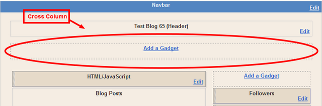
Now go to your blogs design page and add the menu across your blog below the header.This area is cross column as shown in the image below now click on the Add a Gadget and select HTML/Javascript gadget from the list.
Now Add The Menu HTML
In your blogs design click on Add A Gadget > Choose HTML/Javascript > Copy and paste the following code into the HTML/Javascript gadget.
<div class="nav">
<div class="table">
<ul class="select"><li><a href="#"><b>Sample</b></a></li></ul>
<ul class="select"><li><a href="#"><b>Sample Menu</b></a>
<div class="select_sub">
<ul class="sub">
<li><a href="#">Sample Menu</a></li>
<li><a href="#">Sample Menu</a></li>
<li><a href="#">Sample Menu</a></li>
<li><a href="#">Sample Menu</a></li>
<li><a href="#">Sample Menu</a></li>
</ul>
</div>
</li>
</ul>
<ul class="select"><li><a href="#"><b>Sample Menu</b></a>
<div class="select_sub">
<ul class="sub">
<li><a href="#">Sample Menu 2</a></li>
<li><a href="#">Sample Menu 2</a></li>
<li><a href="#">Sample Menu 2</a></li>
<li><a href="#">Sample Menu 2</a></li>
<li><a href="#">Sample Menu 2</a></li>
</ul>
</div>
</li>
</ul>
<ul class="select"><li><a href="#"><b>Sample Menu</b></a>
<div class="select_sub">
<ul class="sub">
<li><a href="#">Sample Menu 3</a></li>
<li><a href="#">Sample Menu 3</a></li>
<li><a href="#">Sample Menu 3</a></li>
<li><a href="#">Sample Menu 3</a></li>
<li><a href="#">Sample Menu 3</a></li>
</ul>
</div>
</li>
</ul>
<ul class="select"><li><a href="#"><b>Sample Menu</b></a>
<div class="select_sub">
<ul class="sub">
<li><a href="#">Sample Menu 4</a></li>
<li><a href="#">Sample Menu 4</a></li>
<li><a href="#">Sample Menu 4</a></li>
<li><a href="#">Sample Menu 4</a></li>
<li><a href="#">Sample Menu 4</a></li>
</ul>
</div>
</li>
</ul>
</div>
</div>
This is the code that's make the navigation menu as same as situated in the demo or image.Replace the Hash tags (#) with your links.First give few minutes to this HTML coding and if you want to add some more links so repeat the above steps same in HTML coding.
Now save this gadget and this unique navigation menu is ready for your blog now see how's it looks on your blog.
Drop your Questions & Suggestions below in the form of comments.
No comments:
Post a Comment
Any Question, Feedback, Suggestion and Idea are always welcome.If you are asking a question then don't forget to subscribe the following comments for getting answers directly in your mailbox.